

Problem
What needed to be clarified
Fleet and load-management decisions depend on connected information: route, location, vehicle type, availability, timing, commercial terms and offer status.
Showing every data point at once would make the product difficult to scan. Separating each task too much would make the operational state harder to follow.
Users and context
Who the product had to support
The source describes the concept for exporters, importers and fleet operators. The visible screens suggest users needed to compare operational options, review locations and act on bids or offers.
Constraints
Limits kept visible
- Several connected workflows within one product.
- Dense operational and commercial information.
- Tables, cards and maps presenting related information in different forms.
- No documented production launch, research study or usability-test evidence.
Process
How the work moved forward
Map connected operational objects
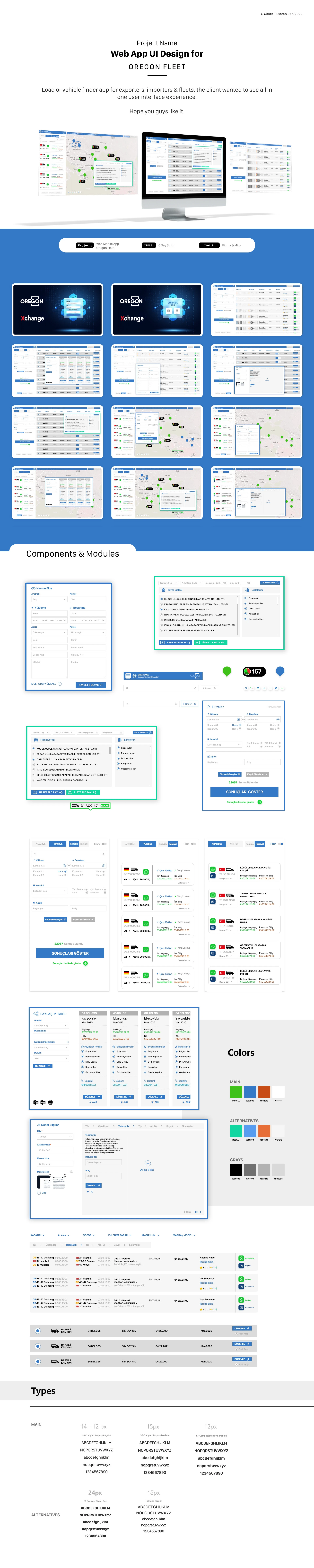
The work translated loads, vehicles, routes, locations, offers and communication into connected interface areas rather than isolated screens.
Build comparison and detail patterns
Tables support scanning and comparison, while cards and dialogs provide focused summaries for individual loads, vehicles and commercial actions.
Establish reusable UI behaviour
Repeated status treatments, filters, controls and content modules create a consistent language across discovery, offer and communication flows.
Evidence
Evidence and inputs
The approved source visuals show data tables, map views, vehicle and load cards, bids, offers, messaging, dialogs and reusable interface patterns.
Production use, user testing and measurable business outcomes are not available for this retrospective case study.
- Tools shown in the source include Figma, Miro and Adobe Photoshop.
- The portfolio source presents the work as a product concept.
Design decisions
Choices that shaped the interface
Organise information around operational decisions
Status, route, timing and commercial information are positioned close to related actions so users can understand what to compare and what to do next.
Keep overview and detail connected
Map and list views offer different ways to understand the same operational landscape. Focused dialogs let users complete actions without losing page context.
Reuse status and interaction patterns
Repeated controls and content modules reduce the need to relearn each part of the product as users move between discovery, offers and communication.
Outcome
What the work produced
The project produced a broad UI concept and reusable visual patterns for load and vehicle discovery, offers and operational communication.
No production, user-testing or measurable business outcome is presented for this retrospective case study.
Learning and next steps
What the next pass should test
Dense interfaces become clearer when the hierarchy follows the decisions users need to make rather than the full amount of data available.
- Validate the information hierarchy with fleet operators.
- Compare table, card and map views using realistic tasks.
- Document production context and outcomes if reliable project records become available.